
Creating credible threat
This week I want to talk about how to dissect a bubble (carefully I guess).
Last week on This Week In Footy Jasper Chellappah talked about bubbles when examining Carlton, after Adam Simpson brought it up on his segment on AFL 360.
In the modern game teams generally defend space more than they defend players. Cody Atkinson and Sean Lawson wrote about this for the ABC back in 2020. In the broadest and simplest terms, a defence will be relatively happy if they can make close options risky, and long options easy to neutralise – the attacking team want to do the opposite.
To maximise their chances, the attacking team needs to pose as many credible threats as possible. Even if you don’t use them on a given play, the more places a team feels like it needs to defend, the weaker its defence will be in any one spot.
Consider a simplified example below. The attacking team in blue is seeking to advance the ball from a half-back flank.
The first team is known for not utilising switches or short sharp passes. Three defenders are able to guard the 30-55m range with a lot of overlap. There aren’t any kicks in the attacking team’s comfort zones that are good options and they likely end up kicking it long and hoping for a stoppage or a contested mark.

The second team has good foot skills, they utilise short kicks and are capable of switching effectively too. Defenders need to move forward to be able to guard the 20-30 metre kicks which then creates opportunities for long kicks. They need to actively guard against a switch creating more space again. That space will be filled by defenders further up-field, but we are still stretching them thinner across the whole field, and putting them out of position if the ball does get through.

In fact, it’s actually compounded when you look at the second line of defenders. Not only do they need to move up to cover some of the first disposal possibiltiies.
I’ve been wrestling for a couple of weeks now for how to look at how a team creates credible areas of threat (short of having access to GPS data or behind the goals footage and another 40 hours in my week).
What I do have is where the ball has gone. It seems pretty logical that a threat is only really credible if it gets used sometimes, so if we look at where the ball has tended to go, we can see whether a defending team can limit the space they’re guarding, or have to stretch themselves.
As a starting point I’m looking at just intercept possessions at what I’m calling true half-back - 40-60 metres from defensive goal, within the width of the centre square.

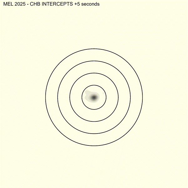
My first instinct was to go with heatmaps of where the ball tends to have gotten to within the first X seconds after the intercept possession. You can see an example below, and I may return to that, but I really wanted something that could help me categorise rather than just visualise. Each ring represents 25 metres from the point of intercept, and up is towards attacking goal.
My second attempt, and what I’m still iterating on, takes inspiration from Richard Little’s game style previews which included a graphic on direction exiting stoppage.
Like in the above gif, up represents towards goal, and each ring represents 25 metres from the point of intercept. There’s a couple more things to unpack though.

The diagram is divided up into sectors – Forward (within 30 degrees either side of straight ahead); Left and Right 45 (30-60 degrees), Left and Right Lateral (60-120 degrees), and Backwards (greater than 120 degrees).
Each of those sectors is depicted through two things – colour saturation, and radius. The colour saturation represents the proportion of intercept chains that were within that sector X seconds after the intercept. The radius of the wedge represents the distance from the point of intercept they reached (radius is drawn at the 80th percentile of distance for chains in that sector, or put another way 4 out of 5 times the ball is within the shaded distance). Given these represent a point in time after the intercept, it’s probably more helpful to think about the radius as representing speed rather than just distance.
So we can see in the above that generally 6 seconds after an intercept the ball is most frequently in the front sector for all types of chains. For scoring chains we can see a relatively even spread across 45 and lateral zones and it’s less frequent for the ball to still be behind the point of intercept. The most obvious thing however is speed of movement. For chains ending in stoppage, 4 in 5 of the frontal chains have been contained to within less than 25 metres of the point of intercept. For scoring chains this is doubled to 50 metres.
Let’s now look at the whole league.

A couple of quick things to consider:
Wedges are drawn at the 80th percentile of distance from the point of intercept in that sector – that is, for 4 in every 5 intercept chains the ball will be within the drawn areas 6 seconds after the point of intercept. Wedges are shaded darker based on the proportion of chains that are within that sector.
For every team other than Essendon (and St Kilda very marginally), the front sector is the most used
For every team other than Essendon, the front sector is the most used for their opponents.
Carlton and the Giants’ opponents aren’t going forward quickly – 80% of chains in the forward sector have travelled around 12 metres or less – contrast to Essendon, Richmond, and Sydney where that’s around the 50 metre mark.
St Kilda have one of the most balanced threat profiles, pretty well spread across front, lateral, and right 45s. They are also still in the back sector, but with the distance involved it looks like this is probably more from being behind the mark rather than actively moving the ball backwards.
Richmond favour long,lateral movement to the right.
There’s a few important provisos here to keep in mind:
This is very much a work in progress, and it’s something I’ll likely keep iterating on through the season
The chart presented here doesn’t differentiate between intercept marks and non-marks
This is primarily about style, not effectiveness. I haven’t represented retention rates at all here.
We are still early in the season so sample sizes are low – things will be impacted by single game anomalies and which opponents a team has faced.
As always, this is very much a work-in-progress. If you have feedback the best place to yell at me is over at bluesky - http://bsky.credittodubois.com