
Introducing Territory Charts
People that follow American football might be familiar with an image along the likes of this.

They’re called drive charts, and are a really effective way of quickly demonstrating the territory battle that is at the heart of the game.
For a while now I’ve been wondering about whether there could be an equivalent for Australian rules football. Despite being much more free-flowing than American football, the territory battle is still core to Australian rules.
Having spent a while in R (a programming language built for statistical analysis), I decided to give it a crack myself. Over the last couple of weeks there’s been a fair bit of iteration, based on some great feedback and suggestions on twitter, and I’ve included some of the key milestones below.


I think I’m now relatively settled on a format, and able to replicate it in R. This latest version emphasises accessibility, with a consistent colour palette for the pitch illustration that (I hope) remains legible for all forms of colour blindness.
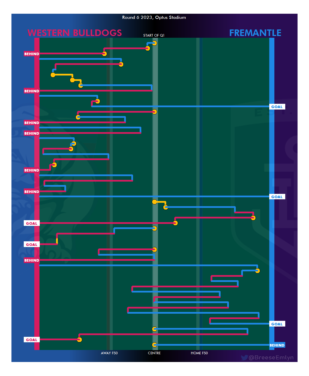
There’s a fair bit going on, and while I aim to make it intuitive it’s worthwhile explaining some of the design elements and what they represent.
Firstly, the chart is based on the concept of possession chains. Possession chains are effectively a period in which one team is in control of the ball. Whenever there is a turnover, a score, or a stoppage, a new possession chain begins. In my territory chart this is depicted by a new line, and should be read from the top to the bottom.
The main information being displayed is distance to goal-line, with the feint markings indicating the centre, and 50 metres from each team’s goal (with the attacking team kicking to the right). Those 50m lines don’t exactly equate to an inside 50 though. To display both teams distance to goal on the same axis, the distance actually represents how far from goal the ball would be if it were in the centre corridor. For example, a ball at tip of the 50m arc is 50m from goal. If you take that ball and shift it 30m directly towards the wing, it will now be around 58m from the goal, but would still be represented at the 50m line on a territory chart.
The colours of the lines indicate which team is in possession of the ball, and yellow indicates neutral possession (the ball moving along without one team in clear control). Ball-ups and throw-ins are represented by a yellow octagon.
To give an example of how to read the above chart in practice:
The quarter starts with a stoppage in the middle of the ground (a centre bounce)
Fremantle concede a small amount of distance, and then a stoppage occurs
Bulldogs win the ball from stoppage, advance it to within 50m of the goal line, and another stoppage occurs
Bulldogs score a behind from this stoppage
Fremantle takes the kick-in, taking the ball slightly past 50m before a stoppage occurs
The bulldogs win the stoppage and take the ball deep into attack.
Fremantle cause a turnover, concede some territory, and a stoppage occurs
A further two stoppages occur, with Fremantle gaining territory between each without clear possession.
Strengths of the territory chart:
Can give a good at-a-glance read on which team is controlling territory more effectively throughout the game
Can depict who is capitalising on territory gains vs conceding turnovers and where
Shows where stoppages are occurring, who is winning them, and to what effect
Shows where scoring chains are being started from for each team.
Weakness of the territory chart:
Can’t depict the ball’s position across the width of the field
Only depicts start/end point of a chain, not individual possessions and not where the ball goes further before being brought back (conceding ground as part of a switch for example
Doesn’t depict time in quarter or speed of ball use
Can’t depict individual possessions
Some potential changes I’m looking at in the near future:
What it looks like if the Y axis on the chart depicts time in quarter rather than just a consistent gap between possession chains. This would allow the chart to depict speed of ball use and time in quarter. However, it may be difficult to implement while still making the chart legible at a glance
Ghosts/trails for the chart to demonstrate where the ball went backwards from the starting point (before returning forwards again) or forwards from the end point (before going backwards)
An emphasis as possession is inside the F50 Arc to complement, or potentially replace, the current markings of 50m in line with the centre of the ground.
Tidying up the code in the background, as there’s still fairly regular (a couple times a quarter) that require manual edits because the X coordinates get flipped from one side to the other.
I think this idea has a lot of legs in helping to understand how a game flows. I’m keen for any suggestions so hit me up on twitter. Also feel free to ask any questions you’ve got on what I’ve done so far.
Addendum - I’ve since included a speed caption on chains, this represents ball speed in line with the goal (e.g. a switch from one wing to the other would be ~0 speed). It also cuts off the time between a mark/free kick is taken and the resultant set shot at goal.
